Wednesday, 27 April 2011

New idea for my Evaluation
After planning and starting my first idea for my evaluation I realised it was to complicated and would take more time than I thought and i decided to change my evaluation. My evaluation is now going to be a Prezi presentation I think this will look really good and be creative aswell as giving information.
Monday, 4 April 2011
Front Cover, Contents and DPS

This is my final and finished product I am really pleased with how it came out although it can be better because nothing is ever perfect but in my opinion I think it shows what I want it to and fits the target audience.
Final and Finished Double Page Spread
 This is my final and finished double page spread. I really enjoyed making this and think it looks like a real double page spread if anything need to be improved I would add more text because it could be longer but I feel the information I have given will give the audience advice and feel if you give them to much advice it is not taken in.
Final and Finished Contents Page
 This is my final and finished contents page I have changed alot and feel it has improved alot. I have changed the layout of the page numbers and text, added an image and caption to go with it at the bottom of the page and I have added a picture to go with the editors letter. I also put the website address and subscribe this will help by making more of the audience think about subscribing to tht magazine. I am really please how the contents page has come out and think it is much better than my first attempt.
Monday, 28 March 2011
ideas for evaluation
- power point
- video
- voice over
- written creatively
These are some ways i can show my evaluation i have the idea to make a creative interview in the style of a double page spread i can do this as a page like a magazine or add a voice over to it and make it creative and different.
Friday, 25 March 2011
dps

This is my double page spread about a star called Mia Egan. I decided to use four photos as i thought it needed more to attract the audience. I looked at real magazine dps to get an idea of what to do this really helped me and gave me ideas for my own. I think my double page spread came out quite well for a first attempt but i can improve it my adding a bigger interview and i could have better pictures although i do like the pictures i have already but they may be to similar.
Friday, 18 March 2011
Finished Contents page
 This is mt finished contents page but i feel it needs improvement after talking to my subject teacher and looking over it i still need to change things such as make the numbers of pages go in order from smallest to biggest and change horosopes as a page because it doesnt fit into my magazine. After changing these things i think the contents page will look much better are more professional.
Improved front cover
 This is my improved front cover I have made the red text stand out more, moved the masthead, make MIA text bigger and moved the date and issue number. After doing this I am more confordent in how my front cover looks if i need to change anything i think it would be adding another colour around the MIA text.
Feedback: how i can improve my front cover
I had a meeting with my media teacher and we discussed how i could improve my front cover:
- Make my text slightly bigger i.e the masthead
- colour scheme doesnt stand out like most magazines do make it a bit brighter
- move around the text and make slightly bigger
- add date and website at top corner
Monday, 14 March 2011
contents page first attempt
 This is my finished first attempt at my contents page. In my opinion I don't like the layout of the text and think it is dull and I need to add images and more text, I also feel I need to add a picture of the editor because it lets the audience know who's talking to them and makes them feel more comfortable.
 Sunday, 13 March 2011
First attempt at contents page


These are the first stages of my contents page. I wanted to keep the same colour scheme as if it was differnt the audience wouldnt connect the two pages together and it wouldnt look right. I need to add a editors letter because for my magaizne i think the audience need a letter to inspire them about the magzine and feel my target audience teenage girls will expect one as many teenage girls read other magazine for example Look, Heat and Glamour all have editors letters.
I wanted to add a charts list but now i dont think it should be on the contents page and if it just had a short piece of writing like "who beat lady gaga to the top" it would make the audience want to find out the top charts.
Thursday, 3 March 2011
First attempt Beat Magazine Front Cover
This is my finished first attempt at the front cover for my magazine. I like the new mast head and think it really works with the colour scheme and it stands out which is what its ment to do, but it could still be a little bigger and i will experiment on the sizes to use for it. My stapline i really like what it stands for being passionate about music but im not sure if it is in the correct place so i will also try out other places it can go. All my text needs to be bigger but the font should stay the same and the colours when i have done this i believe it will look much better. 
Stages of making front cover


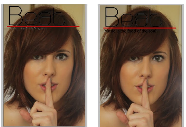
 These are four stages of making the magazine front cover as i added more to my magazine i decided to change the masthead Beat still keeping the name but changing the font and colour.
I have chosen these colours because i want to make the feel of the magazine more sophisticated
rather than really girly, i think this will work better with my target audience bacause the age is when you are becoming more of an adult and older teens like the sophisticate look.
I decided to use a big image of the artists face because i think it draws you in and works really well and by having it so dominant it shows the artists is a main part of the first issue. I wanted to make the font stand out aswell and not fade into the background this is a weakness with my front cover and i feel it needs to be changed.

This is the photo i decided to use for my front cover. I decided to get the model to pose saying shh as it in my opinion makes someone at first glance think oh what the secret or this looks interesting. The aim of the front cover is to show a famous artist that has secrets to tell and you can find them out.
Wednesday, 2 March 2011

Friday, 4 February 2011
pre-lim task school mag contents page

This is my Pre-lim school magazine contents page. I decided to keep a similar colour scheme as the front cover because its title is "His and Hers" and the colours associated with a girl and a boy is pink and blue and i think these colours should be used throughout the magazine. I think my contents page is average but now i look at it comparing it to professional magazine contents pages it could be much better. This will help me when designing and making my music magazine.
Thursday, 3 February 2011
Magazine Contents Page Analysis
FHM
There is one dominant image in this contents page that shows the focus of the magazine, this will be what the attracts the reader when opening the page as there is hardly any text compared to a women's magazine. The reader will like this as the targeted audience aren't very interested in reading.
the text that is on the page is in big bold letters this points out the main part of each article and the reader will find it easier to read. Making them be able to skim thought what the content of the magazine will be before buying it.
The colour used is simple and by using a white background this makes it easier to read and less fancy matching what the target audience is looking for.
OK!
From the contents page the first impression you get is its a magazine aimed for older women this is because all of the pictures are older women. This doesnt relate to the front of the magazine as it seems to be for a wide range of women this you get from the people on the front i.e kerry amd josie and katy price and cheryl cole these celebs have a fan base of a wide age group of women and alot of fans would pick up the magazine for this reason. When you open the contents page there are no pictures of the celebs on the front and they reader has to read through the contents page to find who they are looking for this is a good thing as they reader already knows the article is going to be there by the front cover but reads the titles of other pages and wants to read them too. By having the text in two different colours red being whats shown on the cover and black what else is in the magazine this helps the reader find what they are looking for. By having titles for different sections it also shows an easyer way to finding the page you want. There is an editors letter in the top right hand corner by having this it makes you feel the magazine is a bit more real and cares about the reader this is a bit possitive to get good relationship with the reader.
The layout is structured and set in a clear and simple way. By having a bold text for the title it points out exactly what the page is. The pictures are on the left and writing on the right this makes it clearer and less complicated so it doesn't confuse the reader making them not bothered to read the rest of the magazine.
There is one dominant image in this contents page that shows the focus of the magazine, this will be what the attracts the reader when opening the page as there is hardly any text compared to a women's magazine. The reader will like this as the targeted audience aren't very interested in reading.
the text that is on the page is in big bold letters this points out the main part of each article and the reader will find it easier to read. Making them be able to skim thought what the content of the magazine will be before buying it.
The colour used is simple and by using a white background this makes it easier to read and less fancy matching what the target audience is looking for.
OK!
From the contents page the first impression you get is its a magazine aimed for older women this is because all of the pictures are older women. This doesnt relate to the front of the magazine as it seems to be for a wide range of women this you get from the people on the front i.e kerry amd josie and katy price and cheryl cole these celebs have a fan base of a wide age group of women and alot of fans would pick up the magazine for this reason. When you open the contents page there are no pictures of the celebs on the front and they reader has to read through the contents page to find who they are looking for this is a good thing as they reader already knows the article is going to be there by the front cover but reads the titles of other pages and wants to read them too. By having the text in two different colours red being whats shown on the cover and black what else is in the magazine this helps the reader find what they are looking for. By having titles for different sections it also shows an easyer way to finding the page you want. There is an editors letter in the top right hand corner by having this it makes you feel the magazine is a bit more real and cares about the reader this is a bit possitive to get good relationship with the reader.
The layout is structured and set in a clear and simple way. By having a bold text for the title it points out exactly what the page is. The pictures are on the left and writing on the right this makes it clearer and less complicated so it doesn't confuse the reader making them not bothered to read the rest of the magazine.
Friday, 7 January 2011



Subscribe to:
Posts (Atom)